Getting Fitted: Redesigning Karma Sauce For The New Decade
Let's review, shall we?
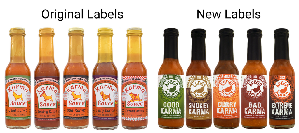
Our original labels were already color-coded, but it was a bit too subtle to notice from a first glance at the shelf. The new labels are more eye-catching and vibrant while also having more cohesive imagery (the yin-yang and mandala pattern all reinforcing the "karma" theme).
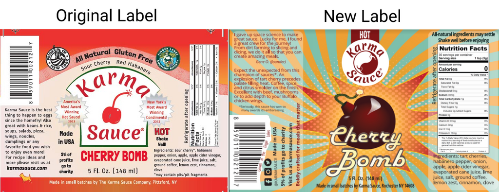
For Cherry Bomb, we knew not to mess around with a concept that already worked. We just added more vibrancy and eye-catching graphics to the cherry on top.
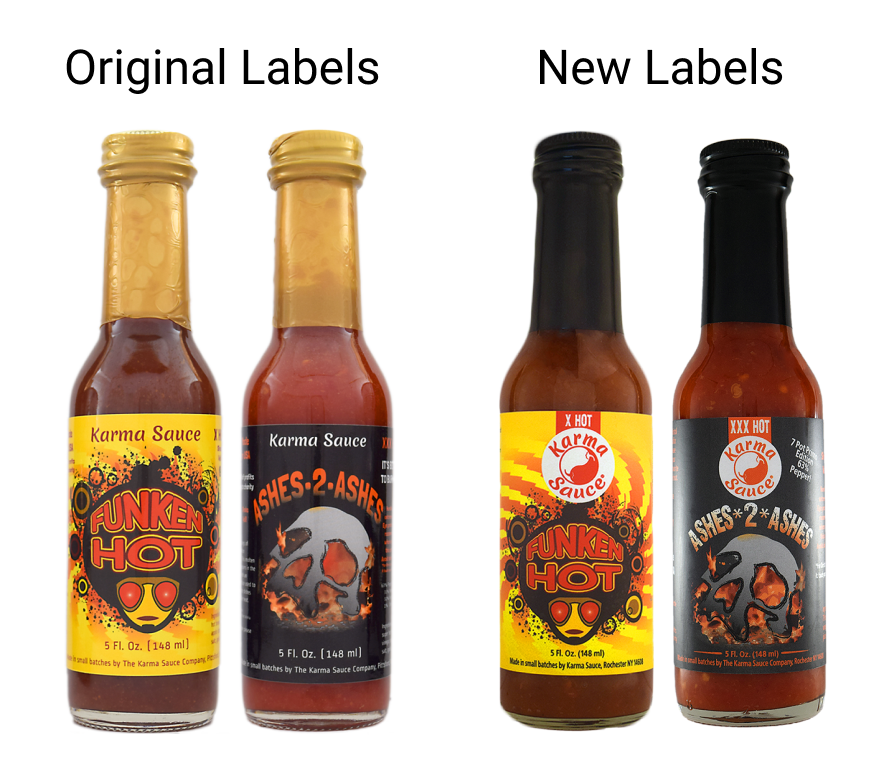
Funken Hot and Ashes 2 Ashes underwent the least amount of change. We kind of liked them as is! But we did want to add our snazzy chile yin-yang.

For Carnival, we added more detail to the mask and added a plastic wrap filter to the decorations to make it pop more. The flames featured in the original were more subtly incorporated as part of the masks ornamentation.
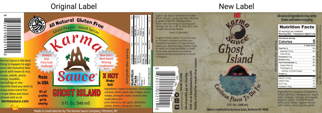
Our last redesign was for Ghost Island. We wanted the new label to play up the "swashbuckling adventure" aspect of the theme, so we used a canvas map-style background and used a pirate-esque title font.

And there you have it! The freshly fitted Karma Sauce lineup.
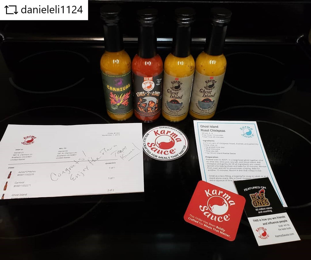
In addition to labels, we've been working on other aspects of packaging, like stickers and magnets from StickerMule, and brochures and other slips from MOO. For instance, we're now sneaking some of these social media cards into our packages, which you can use to get freebies from our site.

Of course, all of these cosmetic additions mean much less than the quality of our products and our principles as a company, and that will always remain the focus. But we're excited to capitalize on the exposure brought on by Hot Ones by giving our products some fresh gloss.
(PS, as it turns out, StickerMule is also doing hot sauce labels themselves these days, which simplifies the process for whenever the next design overhaul happens....)

